facebook
Project & Team Introduction

This project was the collaboration of Renew Ketamine’s doctors, Tanya Dall and Justin Yanuck, and Solution21’s UX-UI Design and Research Team, Marketing and Creative Team, and our in-house developers. We completed a complete UX-UI Website Design from scratch.

The Objective

The objective of the design project was not only to design a custom website from scratch, but to brand Renew Ketamine as a new, emerging business in the ketamine therapy market. As a business without an established brand or presence, our team had more creative liberties to build something amazing.

Bio

Renew Ketamine Infusion Case Study
 Mary Hawkins
Renew Ketamine Infusion
Services Ketamine Clinic Field trip Reset Ketamine Ketamine wellness Mind bloom Infuse Ketamine Ketamine healing
Strength Adequate information on Ketamine Adequate information on the services provided Adequate information on Ketamine Adequate information on Ketamine Adequate information on Ketamine Adequate information on Ketamine Adequate information on Ketamine
Weaknesses Website information is not well organized Main cell to action is inactive Poor visuals No visible call to action on landing page Too much information on landing page ________ Bad UI
Social media Facebook,Instagram,Linkdin,Twitter,Yelp Facebook,Instagram,Linkdin,Twitter Facebook,Instagram,Linkdin,Twitter,youtube,pinterest Facebook,Linkdin,Twitter Facebook,Linkdin,Twitter Facebook,Instagram Facebook,Instagram,Linkdin,Twitter,Yelp
Pricing Free phone consult Pricing available Pricing available _______ Pricing available _______ Pricing available
Case Studies
Competitor Analysis

Prior to any design movement, our UX-UI team analyzed our clients’ market competitors to gain understanding of user needs and places for improvement in the industry that our team could implement in the design process. From the information collected, we were able to determine that the market needs was a website with thorough and organized information, a central call to action, and quality visuals.

About Us
User Personas

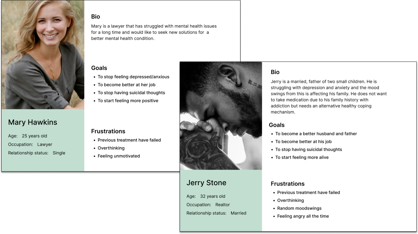
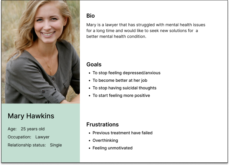
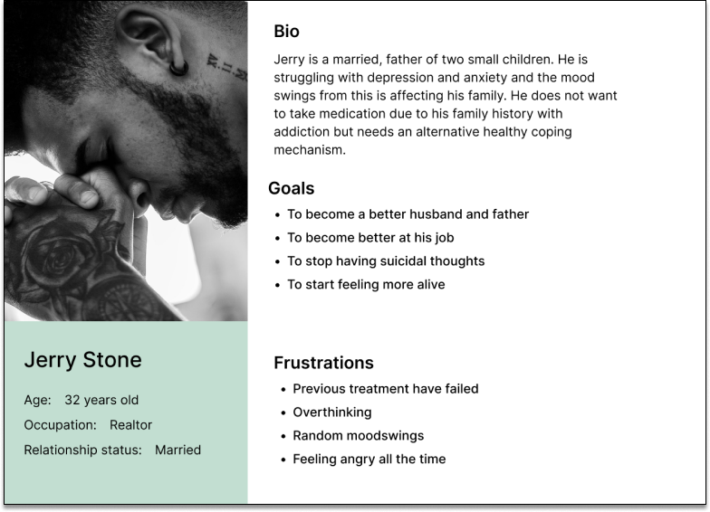
The second part of user research was to evaluate the priorities and intentions of potential users by creating user personas. By having our UX-UI designers step into the shoes of potential users, we gained a better understanding of what users are searching for when on a webpage and what was important to them. As a newer treatment, we felt transparency was most important.

Information Architecture - Sitemap

Site Map

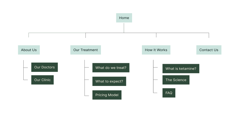
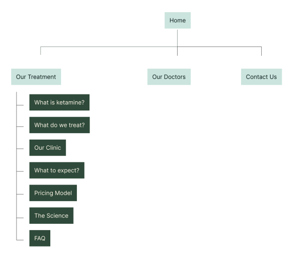
Based on the information we gained in the user research phase, we built a site map that intentionally addressed user and market needs. As you can see, we included several pages dedicated to transparent & information about the services, the science behind ketamine, the clinic, and what the therapy is used to treat.

Site Map
Low-Fi Wireframes

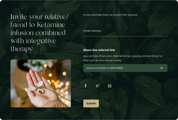
Once the first phase of ideation as complete, we began to create a variety of low fidelity mockups. We decided for an open layout, with few sharp lines and slots for high quality visuals to emphasize the calmness and tranquility of therapeutic treatment. We also accomodated in the design multiple slots for information and graphs to ensure transparency of the treatment to avoid misinformation.

Home_LW
Renew Ketamine Infusion - Case Study
 title=
Style Board

When determining the color palette of the website, we opted for earth-toned neutrals and greens to emphasize the natural aspect of the treatment and to coordinate with the nature images the client wanted throughout the website. Our Design and Creative team created the custom color palette below.

Color Palette
Color Palette
Color Palette
Color Palette
Color Palette
Color Palette
Color Palette
Color Palette

High-Fi Wireframes

Case Studies Home Page
What to expect
 Renew Ketamine Infusion case study
Join Our Newsletter!
Please correct the marked field(s) below.
Join Our Newsletter!
Learn marketing tips and tricks and stay informed on special deals with Solution21.